
 Curtain
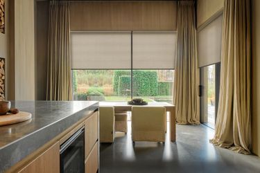
How to Choose Window Shade Fabric Colors and Textures
Choosing window shade fabric is about more than finding a color you like. The right shade should work with your wall color, flooring, furniture, and natural light without making the room feel too dark, too cold, or visually crowded.
A shade that looks like a perfect match on a product page may appear warmer or cooler in your home. Fabric texture also matters: a smooth finish can complement a modern interior, while a woven, linen-look fabric can add softness to a room with wood furniture and natural materials.
This guide explains how to compare window shade colors and textures, with practical room examples and a simple sample-testing method to help you make a more confident choice before ordering.
1. Start With Your Room's Existing Colors
Before choosing a shade fabric, look at the three largest visual elements in the room: your walls, flooring, and main furniture. You do not need to match all three exactly. Instead, choose a shade that complements their undertones and creates the overall effect you want.
Warm White Walls, Oak Floors, and Beige Furniture
Best starting point: warm white, ivory, or light beige.
Imagine a living room with warm white walls, natural oak flooring, and a beige sofa. A bright, cool white shade may look noticeably different from the warmer wall color. Light beige or ivory can create a softer transition between the window, walls, and furniture.
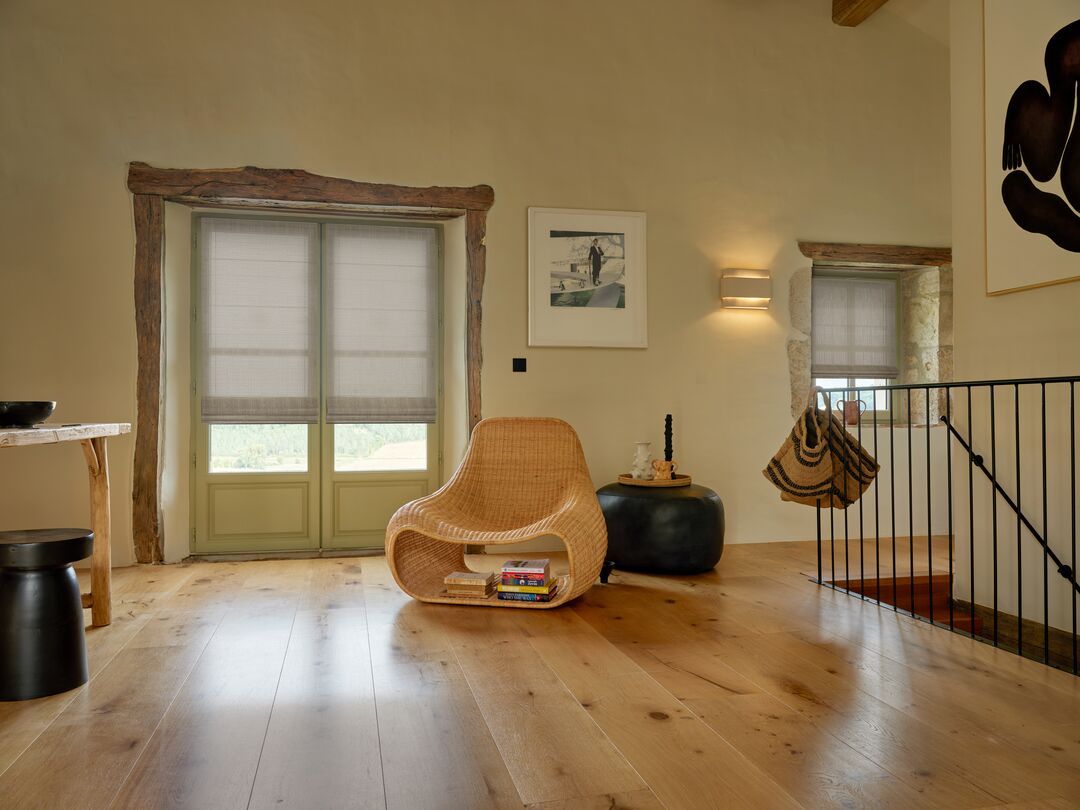
When comparing colors, look at the undertones:
White: Creates a clean, simple look, especially when it works with the trim or window frame.
Ivory: Adds a subtle warmth without the stronger color presence of beige.
Light beige: Can connect the window treatment to wood flooring, beige upholstery, and other warm neutrals.
The potential problem is choosing a shade that is too yellow or too dark compared with the walls. A warm color does not automatically work just because the room has warm finishes.
For a layered light-control option, compare the White and Beige finishes of Persilux Light Control Zebra Blinds. Check the samples beside both the wall and the window trim rather than judging them against a white screen.
Cool White Walls, Gray Flooring, and Black Window Frames
Best starting point: a carefully chosen light gray or another neutral that balances the room.
In a modern room with cool white walls, gray flooring, and black window frames, gray shades can help create a cohesive look. However, not all grays have the same undertone.
A light gray may keep the window area bright and understated. A darker gray creates more contrast and may visually connect with black frames, dark hardware, or charcoal furniture.
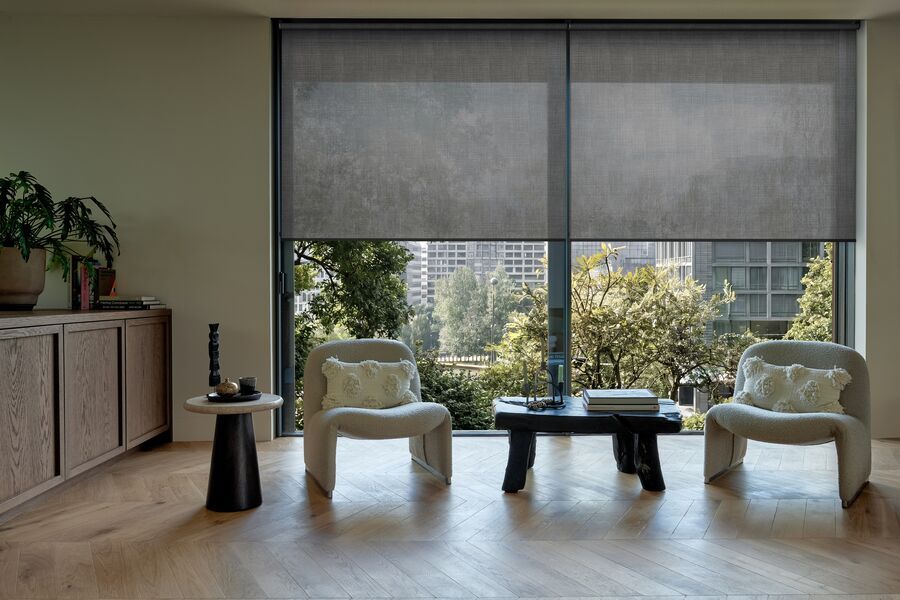
Before deciding, consider the amount of contrast you want:
Choose a lighter shade if you want the window treatment to blend into the room.
Consider a darker shade if you want the window area to feel more defined.
Compare the gray with the flooring in daylight. If the two look too similar, the window treatment may blend into the room more than you intended.
A common mistake is choosing a gray based on its name alone. Some grays look blue in cool daylight, while others appear warmer beside beige or wood finishes.
Explore the available colors of Persilux No Drill No Tools Roller Shades, including Grey, and compare the actual fabric with your flooring and window frames before ordering.
Cream Walls, Natural Wood, and Textured Furniture
Best starting point: light beige, beige, or a natural woven texture.
For a room with cream walls, wood furniture, woven baskets, or textured upholstery, a shade with a linen-like appearance can complement the existing materials without introducing another strong pattern.
Light beige is a useful starting point when you want the window treatment to remain subtle. Beige can create a slightly stronger visual connection with wood furniture and warm upholstery. Brown or dark brown may work when the room already includes darker wood or other substantial dark accents.
Texture matters as much as color here. A smooth fabric may look noticeably different from a woven finish, even when both are beige. The woven surface can introduce visual depth, while a smoother finish creates a more uniform appearance.
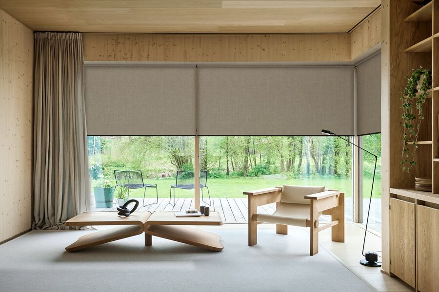
Persilux Natural Woven Linen Roller Shades offer colors including Light Beige, Beige, Brown, Dark Brown, and Bluish Grey. The fabric is polyester fiber with linen added, rather than pure linen, so it offers a linen-look appearance.
Compare Light Beige and Beige first if you want a warm neutral. Then consider Brown or Dark Brown if the room needs a stronger connection to darker wood furniture.
2. Choose a Fabric Texture That Fits Your Interior
Color helps a shade coordinate with the room, but texture affects how the window treatment looks up close and across a larger area.
Smooth Fabrics for a Clean, Simple Look
Smooth fabrics generally suit interiors with clean lines, simple furniture, and minimal decoration. They can also be a practical choice when you want the shade to complement rather than compete with patterned upholstery, rugs, or wallpaper.
If the room already contains several different materials or patterns, a simpler fabric finish can help keep the overall look balanced.
Woven Textures for Added Warmth
Woven and linen-look textures can work well with wood furniture, natural fibers, neutral upholstery, and relaxed interior styles. They introduce subtle surface variation without requiring a contrasting color.
However, texture is not always subtle from a distance. On a large window, a pronounced weave may become a noticeable design feature. Look at the actual fabric sample from both close up and several steps away before making a decision.
Zebra Blind Fabrics for a More Defined Look
Zebra blinds use alternating fabric and sheer bands, creating a more structured visual pattern than a conventional roller shade. The stripes themselves become part of the room's design, so consider how they will look alongside horizontal furniture lines, window grids, and other patterns.
White and Beige can both work in neutral interiors, but the best choice depends on the surrounding finishes and the contrast you want at the window.
See the Persilux Light Control Zebra Blinds to compare the available finishes.
3. Check How Fabric Color Changes in Different Lighting
A fabric color can look different depending on the direction of the window, the time of day, and the light bulbs used in the room. This is why a product photo alone is not always enough to make the final decision.
Natural light can make some fabrics appear brighter, while shadows may make them look darker or more muted. Warm indoor lighting can emphasize yellow or beige undertones; cooler lighting may make some grays appear bluer.
Instead of trying to predict every lighting condition, compare your options in the room where the shades will be installed.
Pay particular attention to:
Morning and afternoon daylight: Does the color look warmer, cooler, or brighter as the light changes?
Evening lighting: Does the fabric still coordinate with the walls and furniture when lamps are on?
The window frame and trim: Does the shade blend with these surfaces or create the contrast you want?
The full window area: Does the color still look balanced when you step back from the sample?
Also consider the amount of light control you need. Fabric color and texture alone do not determine privacy or light-blocking performance. If you need substantial room darkening, check the product's specific light-control or blackout options rather than assuming a darker color will block more light.
4. How to Compare Window Shade Fabric Samples Before Ordering
When two colors look similar online, a sample can help you make a more informed choice. Use this simple process to compare them in your own space.
Step 1: Choose two or three realistic options.
Start with colors that already complement your walls, flooring, and furniture. For a warm neutral room, for example, compare White, Ivory if available, and Light Beige rather than testing a wide range of unrelated colors.
Step 2: Place the samples beside the wall and window trim.
Do not assess the fabric against a white sheet of paper or your phone screen. Put it directly beside the surfaces it needs to coordinate with. This makes undertone differences easier to see.
Step 3: Compare the samples with your flooring and main furniture.
Move the samples between the window, floor, and sofa or other large furniture. A shade that coordinates well with the wall may look too yellow, gray, or dark beside another dominant surface.
Step 4: Check them at different times of day.
Look at the samples in daylight and again under your usual evening lighting. If the window receives strong direct sunlight, compare the samples under those conditions when possible.
Step 5: Step back and consider the whole room.
A small swatch can look different from a full window covering. Consider whether the shade should blend into the room or become a more noticeable design element. Texture and contrast are particularly important when choosing for a large window.
Step 6: Confirm the product specifications.
Before ordering, check the available color, fabric construction, light-control option, and installation requirements on the product page. A color choice should work visually, but the shade must also meet your functional needs.
You can start by reviewing the available options for Zebra Blinds, Natural Woven Linen Roller Shades, and No Drill No Tools Roller Shades. Check each product page for current sample availability and ordering details.
Frequently Asked Questions
Should window shades match the wall color or the furniture?
They do not have to match either one exactly. Use your walls, flooring, and main furniture as reference points, then choose a shade that complements their undertones. Matching the wall can create a subtle look, while coordinating with furniture or wood finishes can make the window treatment feel more integrated with the room.
Are textured or smooth window shades better?
Neither is universally better. Smooth fabrics tend to suit simpler interiors or rooms with existing patterns. Woven textures can add warmth and visual interest to rooms with wood, natural fibers, and neutral finishes. Consider how noticeable the texture will be across the entire window.
Can I choose the right shade color from online photos alone?
Online photos are useful for narrowing down your options, but they cannot fully reproduce the lighting and surrounding colors in your home. If samples are available, compare them beside your walls, trim, flooring, and furniture before placing your order.
Choose a Shade That Works With Your Space
The best window shade fabric complements your room's existing colors, suits your interior style, and meets your light-control needs. Before ordering, compare a few colors and textures in your own lighting to see how they look with your walls, flooring, and furniture.
Not sure which color is right for your home? Get up to 10 fabric samples for just $1.99 shipping! Contact Persilux to request your free fabric samples and compare your favorite options at home before making your final decision.
A little planning can help you choose window shades you'll love long after they're installed.